Great web design takes into account a whole slew of factors, and designers and developers have to juggle a whole lot of information in their attempt to ship code that will make sites performant, user friendly, and useful to end users.
A great web designer has skills that are different than the design skills needed in other parts of the industry. If you meet an amazing graphic designer, skilled in illustration and logo design, they may not have the skills to ship a great site. The two are entirely different and separate from one another. There are tons of things a designer needs to know in order to design a website properly. The UI and UX need to be on point, sure, but what about font loading, UX writing? What about image size, type, and content hierarchy?
Great web designers need to have two things: a good understanding of site performance and code basics, and a great engineer on the front or backend to help make their vision a reality. Sometimes it doesn’t always work out that way, though, and designers end up making mistakes that could cost your site big time. Performance can suffer drastically, and so can your business. But fear not! We’re here to share with you four big mistakes designers make that can keep your site from performing…and how to fix them.
Using the Wrong (or too Many) Fonts
The Problem:
The font a designer chooses to use for a website is one of, if not the most important choices a web designer will make in their lifetimes. OK, we kid. But it really is a big decision for the tone and feel of the website. Not only is it (usually) the first thing a visitor sees when they land on a page, it also drives most of the engagement for the rest of your visitor’s journey.
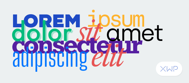
A good designer probably has a solid understanding of the rules of typography and legibility. That means they might want to use specific fonts for body copy, others for headers, and others for calls to action. After all, each font serves its own specific purpose. But font choices that are easy to make in other media can have a huge impact on a website. Weighing down your website with multiple fonts can cause problems on the backend.
Every font, except for system fonts, has to be downloaded when a user accesses your site. If a designer chooses a heavy font (or worse, multiple heavy fonts) for their design, your site could load slower, causing a drop off in users and sales.
The Fix:
There are a few ways you could approach the problem of fonts. First: you could use system fonts. These are the fonts that come pre-installed on all computers. But let’s be honest, system fonts are extremely limited, and won’t do anything to help your site stand out. A good designer thinks about legibility, content hierarchy and page flow, along with the emotion that fonts can convey. That’s why your designer probably shied away from system fonts in the first place.
The second, better option is to optimize the render behavior for your web fonts. The default behavior for most browsers is rarely the best option when you’re aiming for high performance. Instead, try a cycle of iterating and testing different font loading strategies to see what yields the best results. This way you can keep your designers and engineers happy by ensuring your pages are loading as fast as possible. Even with this solution it’s important to try to limit your font choices wherever possible.
RAD (Random Acts of Design)
The Problem:
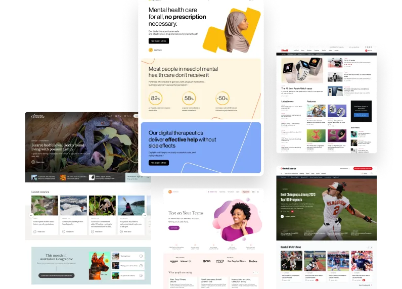
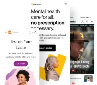
The three stooges. Han, Leia, and Luke. A copywriter, designer, and engineer. Some trios are just destined to work together. But a lot of the time, designers and writers can be on two totally separate wavelengths when it comes to the site they’ve been tasked to build. Or even worse, they’re working in their own silo, only coming together at the end to look at the Frankenstein’s monster they’ve created.
While the two might have the same goal, they’re going to have two very different ways of approaching the task of building your website. When they work on their own, the writer and designer will add sections, create a page flow, and a customer journey that is inconsistent with one another. When an engineer sits down to try and make sense of the layout, they’re going to have a difficult time making it happen. The page will be bloated, over-designed, and worst of all, will negatively affect user retention and conversion.
This isn’t always the case, but too often we’ve seen designs that are shipped without thought of content placement, with the intention of adding in copy later.
The Fix:
This might seem like an idea that comes far out of left field, but stay with us for a minute: have your designers, writers, and engineers work together to create a page structure that fits your needs.
“My model for business is The Beatles. They were four guys who kept each other’s kind of negative tendencies in check. They balanced each other and the total was greater than the sum of its parts. That’s how I see business: great things in business are never done by one person. They’re done by a team of people.”
Steve Jobs
Yup. It’s true. When you get your team to work together, your designers and writers will know what’s actually possible from a backend perspective. You obviously don’t want a bloated design that’s going to cause pagespeed and performance to tank. There are different ways you can sequence the work, but a close collaboration between the words on the page, the design elements that will dictate the flow and experience of those words, and the structure and stability of the code underneath it all will help to enable a better experience for your users.
You’d be surprised what a ‘design by committee’ can be when the three people involved respect each others’ skills and expertise. Channel your inner Curly, Moe, and Larry and take the time to work together.
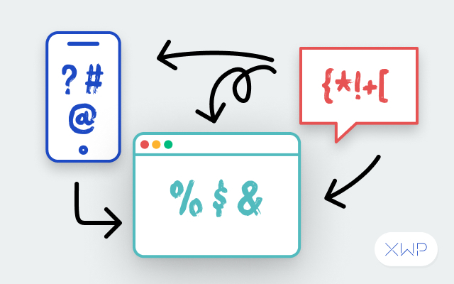
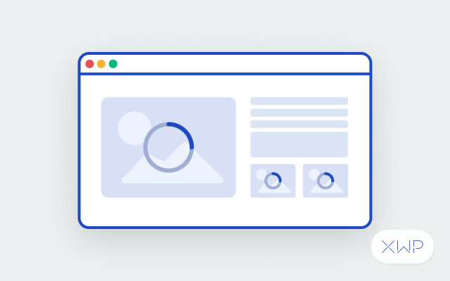
Your Images Are Huge
The Problem:
Images make up almost 50% of the size of the average WordPress website, according to Http Archive. Honestly, that kind of makes sense. From featured images on pages and posts to social sharing icons and everything in between, images are everywhere on a website. And for good reason. People love images. It’s science. But those images can have a detrimental effect on your page speed, and you can’t grab a user’s attention with an awesome image if it never loads in the first place.
The Fix:
Instead of going back and forth with designers and engineers, educate your teams on the importance of optimization, performance, and the impact images can have on site performance. Making optimization an integral part of your design process will help save time and improve performance all around, from your website to your business.
To help your teams learn more about optimization, we’ve compiled a short list (very short!) of some of the things your teams can do to help improve file size and site performance.
- Pick the Right File Type.
.JPG? .PNG? .GIF? With so many image file types, no wonder people get confused. Each type serves a specific purpose, and learning what those file types are for can save you tons of space.
- Compress (but Not Too Much!)
Compressing an image just to make it smaller can have, well, some pretty hilarious results.

See the difference? You want to find a happy medium when compressing images. Try using different compression techniques to get things just right. This will save your page performance, but also keep your images from looking…like that.
- Find a Tool to Help
Just like everything in life, there are tools out there that can make image optimization a lot easier. Our designers love TinyPNG. It does a great job reducing file size while keeping things looking great. But there are plenty of tools out there. Just find the one that’s right for you.
Forgetting about UX
The Problem:
UX is a hot term these days. It’s kind of like ‘performance.’ It’s an extremely broad word that covers so many different aspects of a website (performance being one of them!). While this is a mind-blowing topic that we could spend hours getting into, let’s keep the two separate for now, and think about UX as the user’s actual experience interacting with a page.
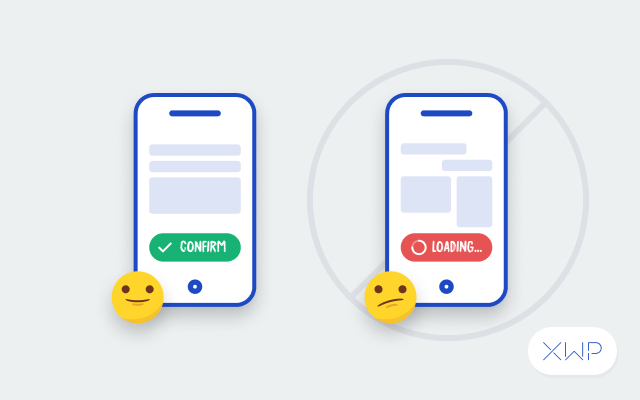
When designing a website, it’s easy to forget that designing for the web is very different from designing for other media; not in basic design principles like color theory or art direction, but in the way that there’s a real person on the other end interacting with your design. Many designers forget about the end user and just create a pretty website. This is great for the eye, but not great for the user.
The Fix:
There are two easy ways to train yourself into this ‘user-first’ mindset. First: learn. There are tons of great examples out there that can help you learn about web design as a facet of design as a whole. Our UX designers love Jeff Gothelf and Jared Spool, but these are far from the only examples out there. Learn. Adapt. Grow.
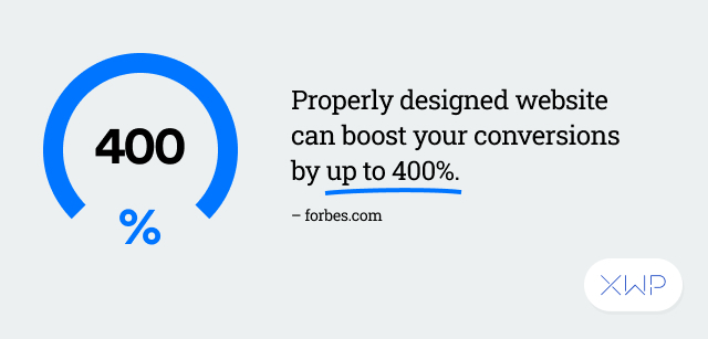
400% – the amount conversions can be boosted on a properly designed website.
Source
The second is a pretty simple one. Think like a user. Think it’ll be difficult? Don’t! Because you are a user. Think about sites you like. How are they designed? What’s in their main navigation? How are their buttons arranged? But not just things you like. What would you change? What minor (or major) tweaks could help make your experience better? Putting yourself in the user’s shoes might be difficult for a project you’ve been a part of from the beginning, but the better you get at taking this ‘outside view’ on your own work, the more your design skills will improve.
When your UX improves, your experience improves, too. Your site becomes more performant, giving users a clear journey to take, ultimately fulfilling the end goal of your website, whether that’s to make a sale, contact a team member, or learn something new.
Not to put pressure on you, but your website design is one of the most important things about your online presence. It has to be user-friendly. It has to be fast. It has to be performant. Plain and simple: it just has to work.
Often, designers will treat a site like any other design project, when in reality web design is a whole other beast entirely. While some mistakes might take a little while longer to work through, there are plenty that can be fixed quickly and efficiently…or even avoided entirely! The easiest thing to remember is to put the user first. From there, everything will start trending upward, including your performance numbers.