
About the Client
OFX grew from the idea that there had to be a better, fairer way to move money around the world. That was 20 years ago, and they’re still driven by the same mission today.
OFX clients are all over the globe. They operate in offices in London, Sydney, Auckland, Hong Kong, Singapore, Toronto and San Francisco. It’s global expertise, delivered locally.

Design Foundations
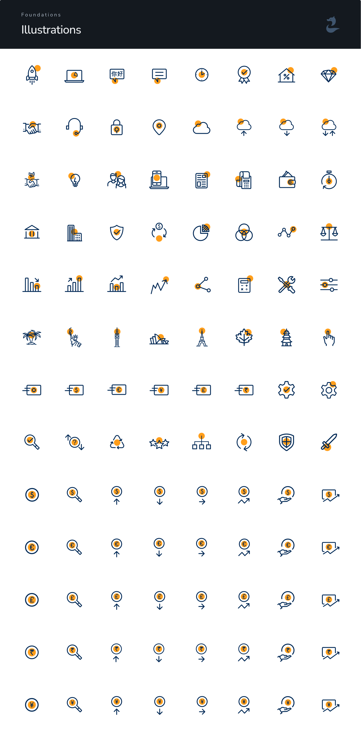
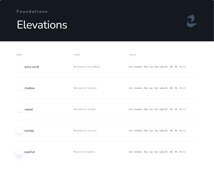
We helped OFX build their design system from the ground up. Integral to this, was the creation of individual components and foundational systems. This involves setting things like type and colour palette, as well the visual approach for reusable blocks.



Foundations
Typography
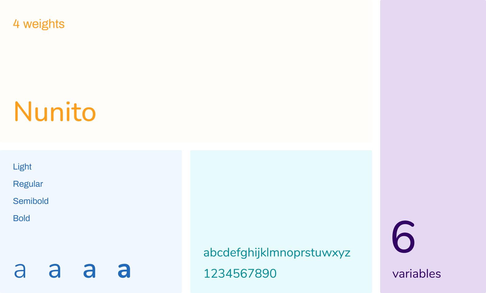
A modern system requires modern type. We made sure that OFX’s new typography approach used a font that matched it’s evolved brand identity.
Foundations
Color Palette
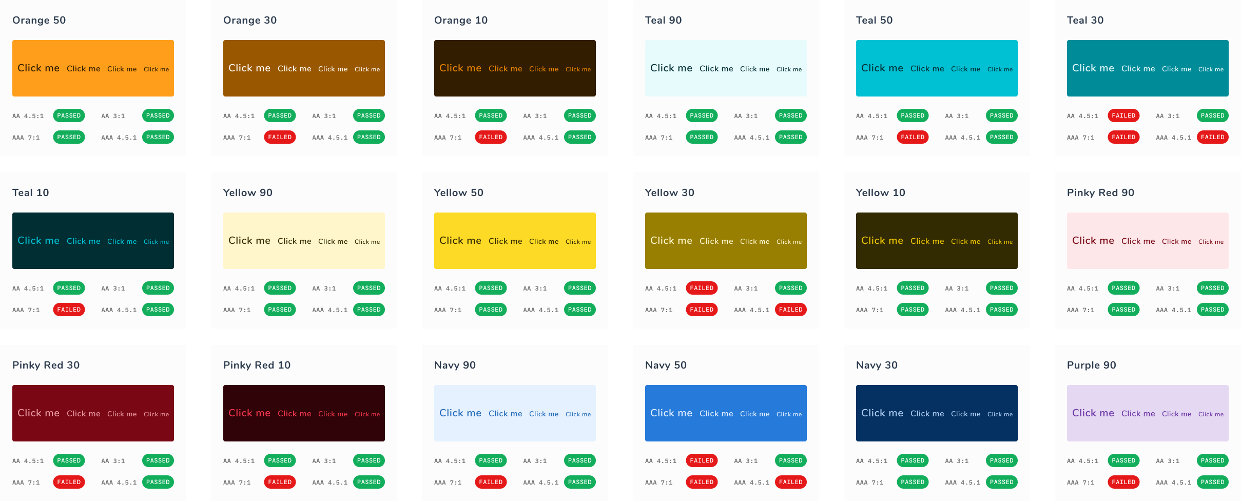
We refreshed the existing color palette to adhere to WCAG web accessibility standards, making sure that it remains vibrant and recognizable for existing Green Our Planet users.


Foundations
Accessibility Scale Check
Our QA team tested all of the new colour combinations according to accessibility standards, making sure that anyone can use the OFX site easily, regardless of their ability.
Foundations
Gradients
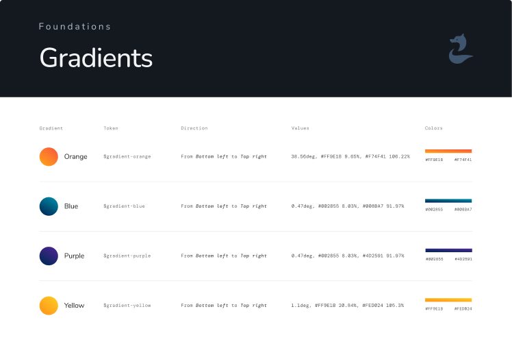
One of OFX’s key concerns was scalability, and having room to experiment while still maintaining a house style. In order to help with this, we created a number of gradients.

Foundations
What was included
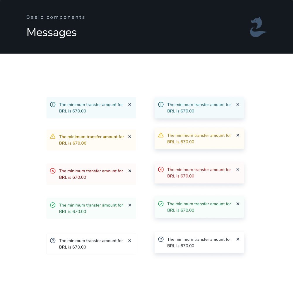
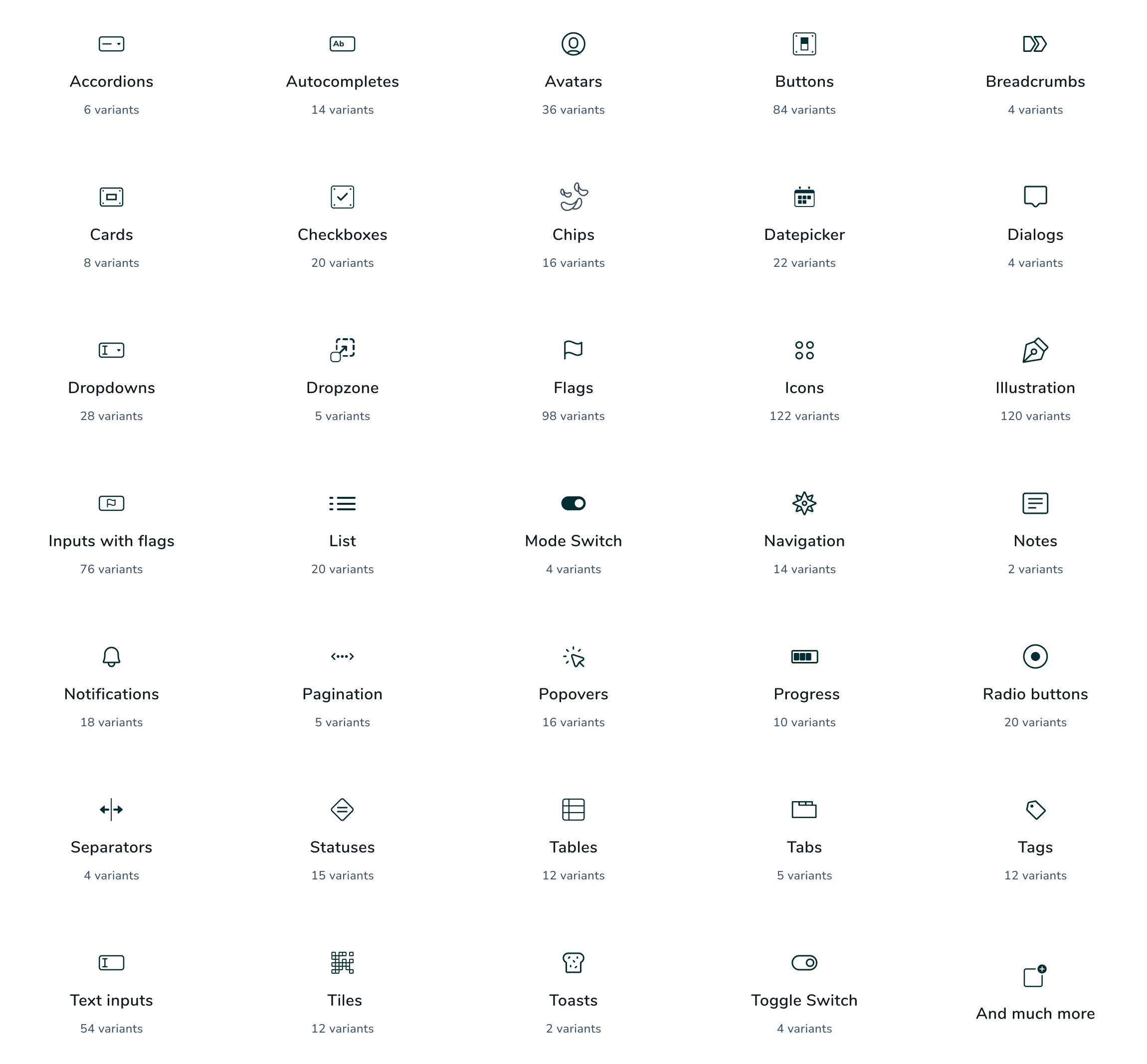
We worked closely with the OFX team to figure out which design elements were essential to their publishing efforts, and what they would like to experiment with in the future.
The result was a brand new portfolio of UI & design components, each of which has a wide panel of variations.
Light & Dark Mode
Lights On, Lights Off
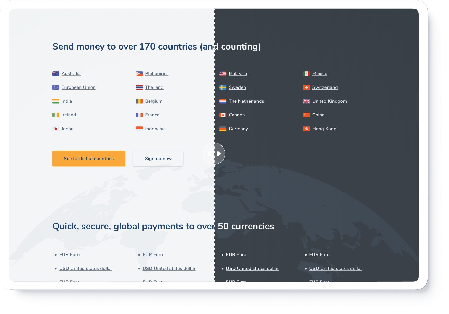
Whether you like to keep your UI light and bright or you prefer things a little darker, the OFX website now has an option to suit your taste. We implemented full light and dark mode across their entire site.
Examples
A brand new system
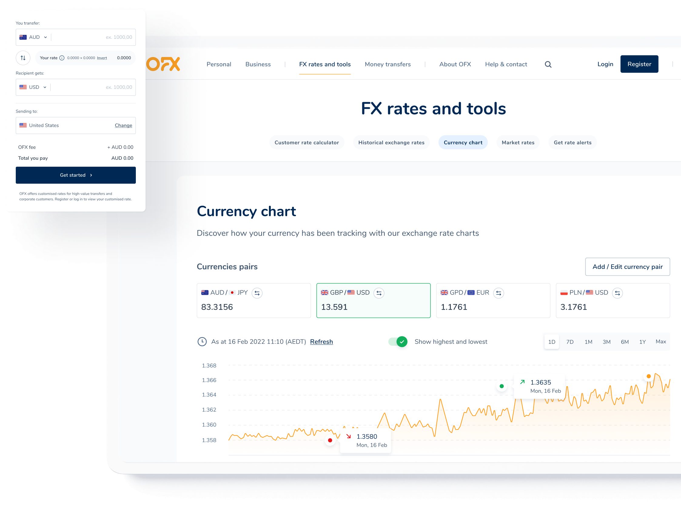
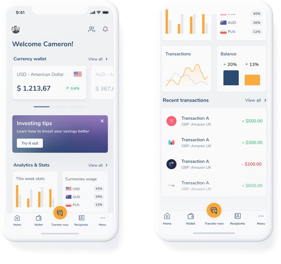
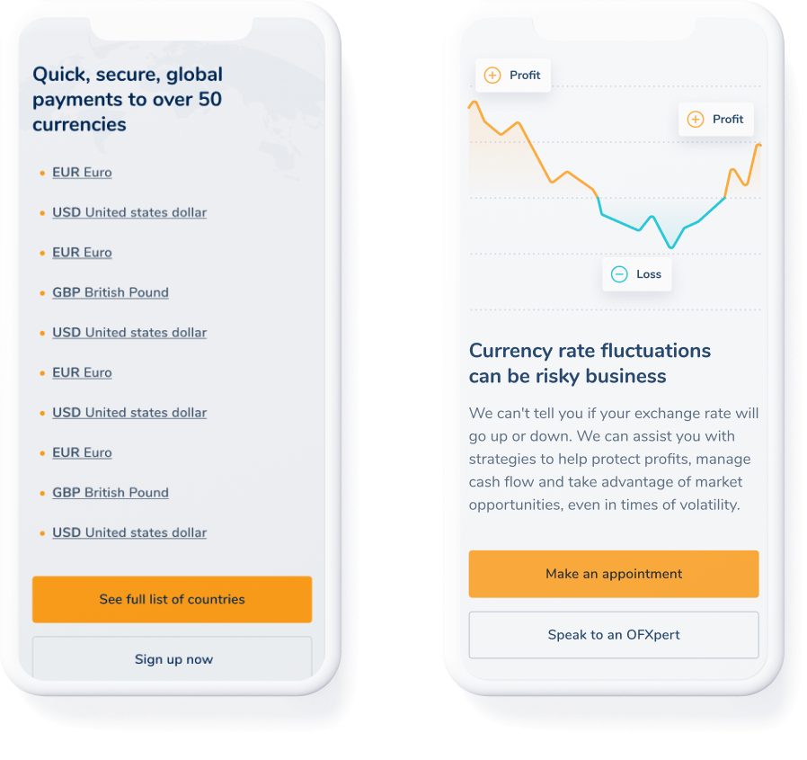
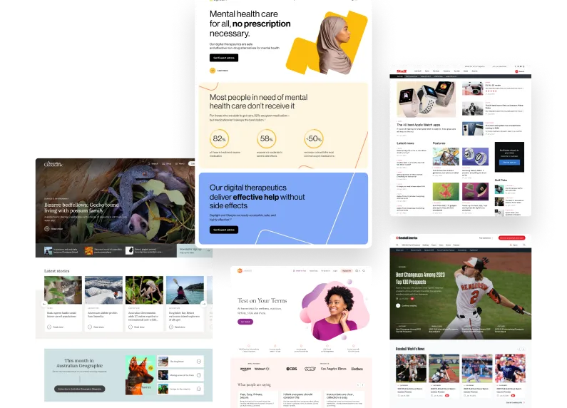
So, what did all this look like? Re-imagined from the ground up, OFX now has a completely new design system that will keep their brand looking fresh long into the future, with clear guidance on maintaining consistency whilst maintaining the flexibility required for them to be creative in their publishing efforts.
