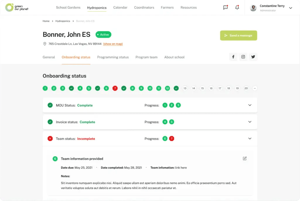
New web app for Hydroponics Program management
When Green our Planet first got in touch with the XWP team, they were looking to expand the flexibility of their site with a brand new, rocket-powered design language and UX. Here’s how the XWP team helped:

Introduction
About Green Our Planet
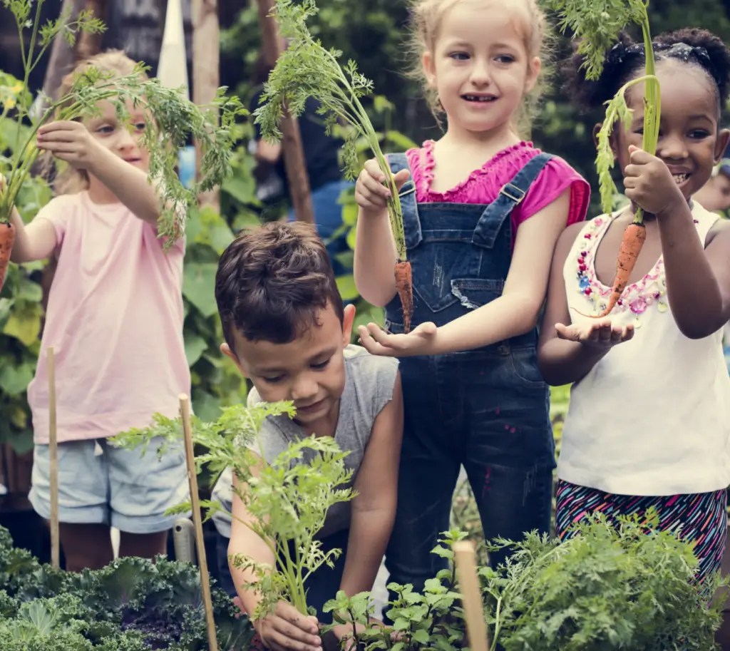
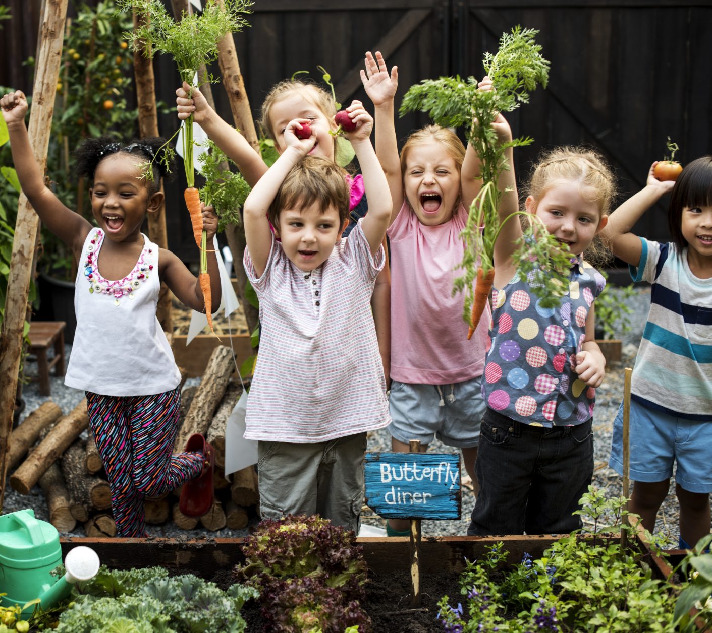
Green Our Planet’s hydroponic gardens provide a natural laboratory for students to learn STEM subjects (science, technology, engineering, and math), conservation, nutrition, financial literacy, and more in a hands-on, experiential way.
Project Goals
Mapping the Process
From the very beginning, we worked closely with the Green Our Planet team, looking for the best possible solution to meet their goals. An open-minded, performance-orientated approach guided us through our journey, all the way from initial research to the final round of QA.

Discovery
We worked extensively with Green our Planet to understand their goals, and looked for ways to meet them.

UI and Interaction
With a thorough understanding of users and goals, we set to work creating a lightning-fast UI.

Development
Our performance engineers brought our designs to life, creating a lightning-fast user experience that’s a pleasure to use.

Quality Assurance
Our dedicated QA team makes sure that all deliverables meet our rigorous quality standards.
Research and Discovery
Features & Functionalities
A thorough discovery process allowed us to create a list of high-impact features and functionalities for the re-imagined Green Our Planet website.
Design System
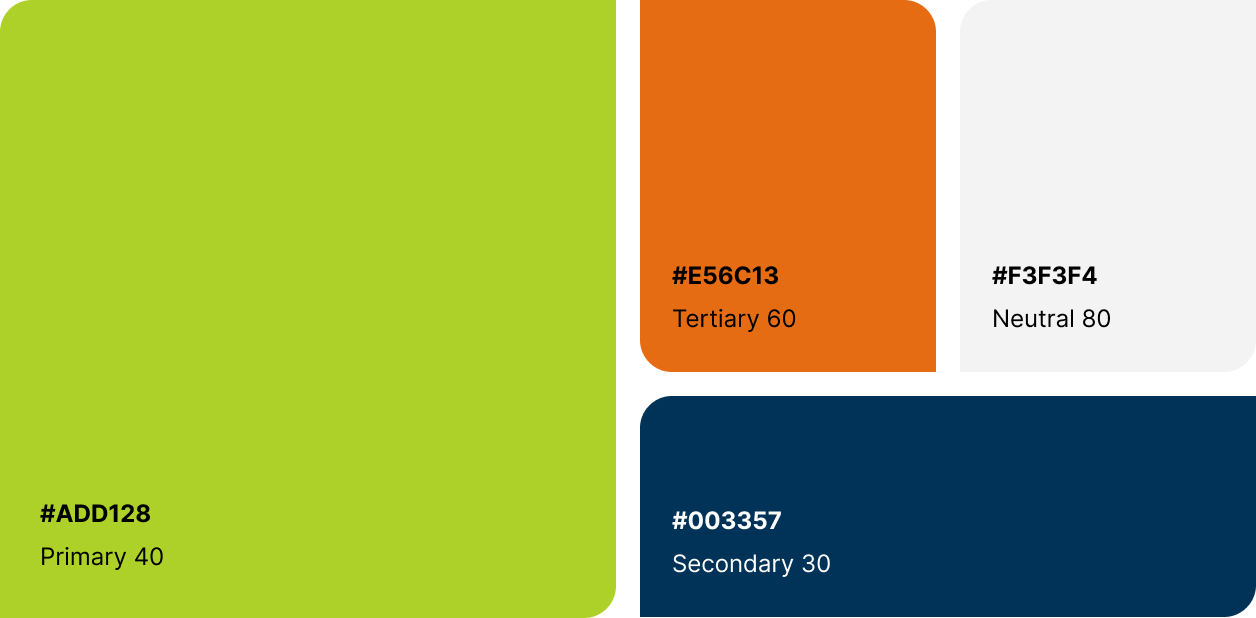
Colors
We refreshed the existing color palette to adhere to WCAG web accessibility standards, making sure that it remains vibrant and recognizable for existing Green Our Planet users.
Design system
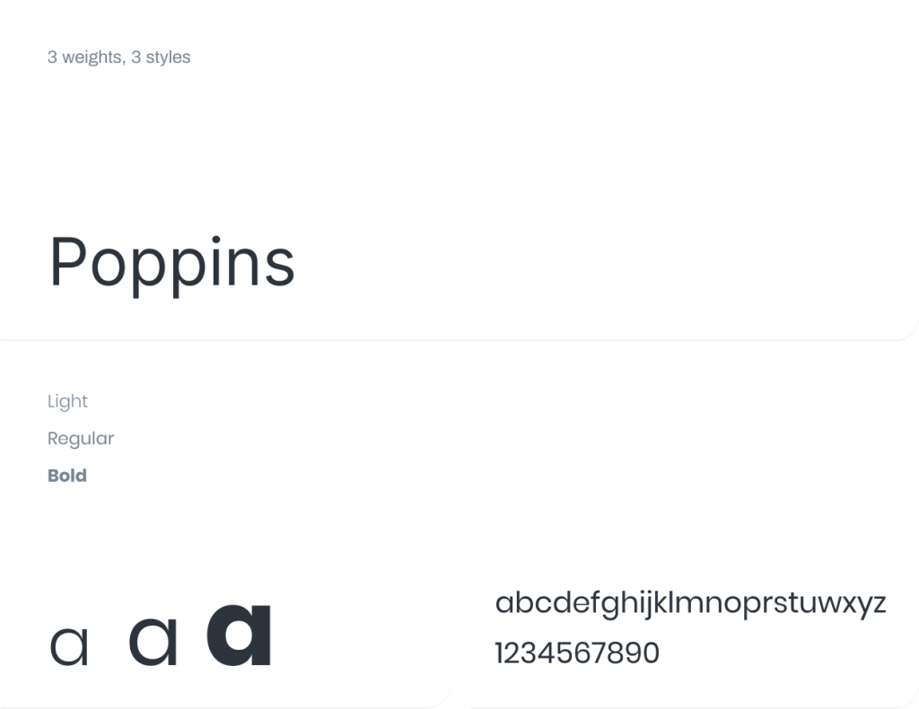
Typography
A modern system requires modern type. We made sure that Green Our Planet’s new typography approach used a font that matched it’s evolved brand identity.
Visual Design
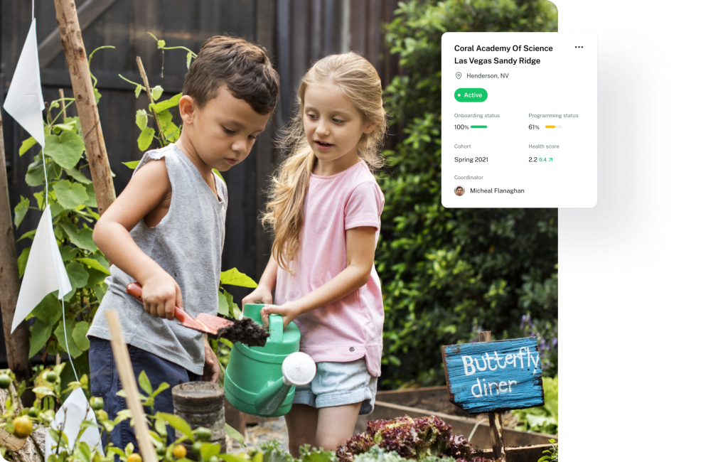
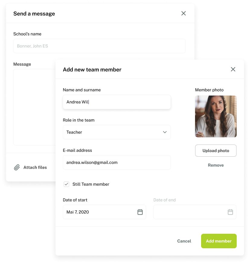
And this is how it looks
The end result is a clean and simple UI that is easy to navigate and accurately reflects their brand, making it easier for Green Our Planet users to filter, search, and highlight the progress of different projects.