Building a new website for one of the world’s largest tech magazines
Stuff is where you can find technology news that’s wry but not dry. The world’s most trusted gadget reviews and exclusive previews of the latest and greatest from the digital world.

Here’s how the XWP team worked to supercharge their user experience, with a lightning-fast UI, nimble load times and clearer routes for content exploration.
Introduction
About Stuff

Stuff covers all the latest news and developments from the tech world, with reviews on everything from smartphones to watches and cameras, and a huge array of features on design and lifestyle—including fashion, modern camping equipment, and all kinds of other wonderful gadgets.
By putting an impressive amount of kit is put to the test, Stuff has rightfully earned a reputation of having some of the most trusted reviews on the web.
Project Goals
Challenges we tackled
We started by running through a thorough discovery process with Stuff to fully understand their goals for the project.
We then mapped an enhanced web offering, with a number of performance-based improvements to help them explore new realms of possibility and expand their reach.

SEO Performance
Reduce bounce rate by improving interactivity, which in turn will improve organic discoverability.

Search System
Maintain a performance-oriented approach to meet Google Core Web Vitals benchmarks.

Site Migration
Create a mobile-first site that meets the expectations of a changing user base.

KPI Setting
Improve interactivity to meet Stuff’s internal benchmarks: Time on site and pages per session.
“Everyone involved in our project has been excellent — XWP’s team has a real depth of talent.”
Steve Jones – Head Of Digital at Kelsey Media
Design Process
The design process at a glance
Our team takes a unique approach to everything we touch, inside and out. From our culture and vision to our projects and clients, we do everything with one goal in mind: To create a solution that performs for you.
Stuff is no exception, with a thorough discovery and understanding phase paving the way for truly exceptional design design package that would eventually increase visibility, capture new markets, and slash bounce rates.

Team Assembly
We started by assembling a team whose strengths best align with Stuff’s requirements.

Discovery
We worked extensively with Stuff to understand their goals, and looked for ways to meet them.

UI & Interaction
With a thorough understanding of users and goals, we set to work creating a lightning-fast UI.

Development
Our performance engineers brought our designs to life, creating the perfect user experience.
Research & Discovery
Mapping the Process
During Discovery, we created a timeline for the proposed design improvements. Wireframing would begin in mid-October so that a fully-tested product could launch in March.
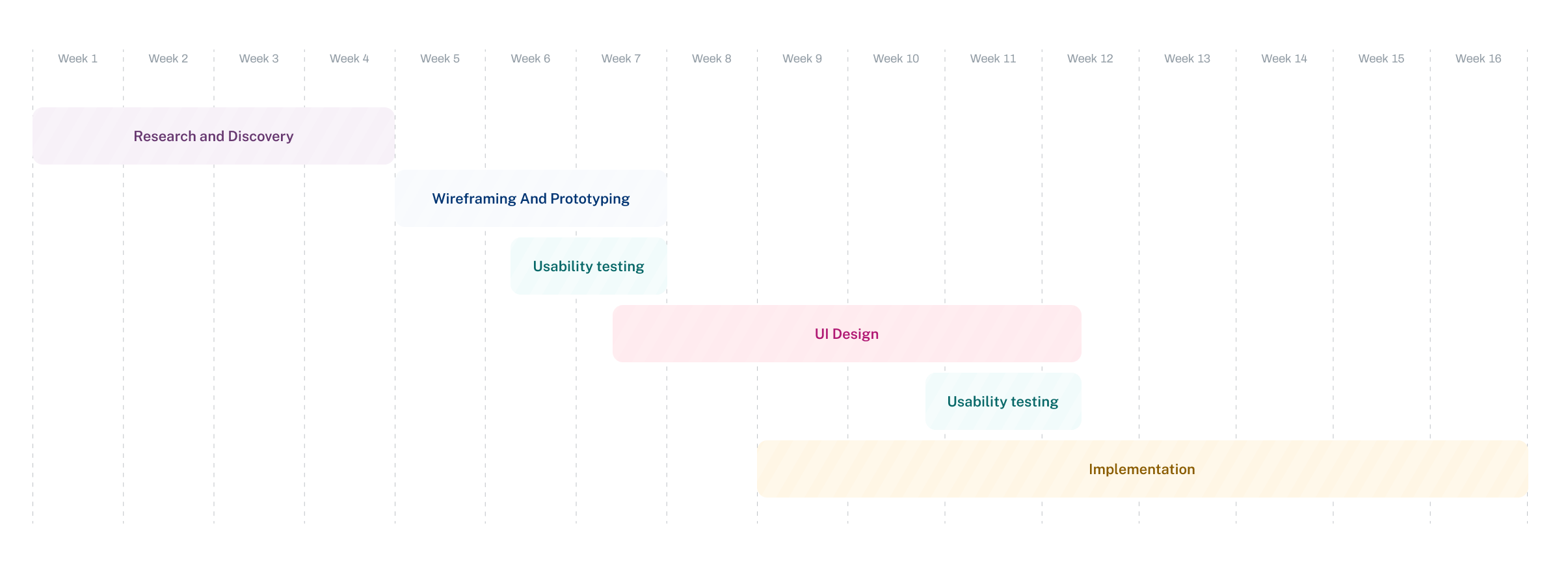
Research and Discovery
What we Explored
Technology isn’t a hat. You can’t sell a ‘one size fits all’ solution to every customer that walks in the door. To engineer technology that works, you need to take an individual approach and provide an individual solution.
We started with a thorough product definition phase, where we worked closely with the Stuff team to fully understand their product goals. We thought about the value and scope of our work, mapping all of our ideas for user experience against their vision for the future.

Envisioning the future
Wireframing and Prototyping
With a complete understanding of Stuff, its users, its competition, and its goals, we ‘put pen to paper’, creating wireframes and prototypes of their new and improved UI.
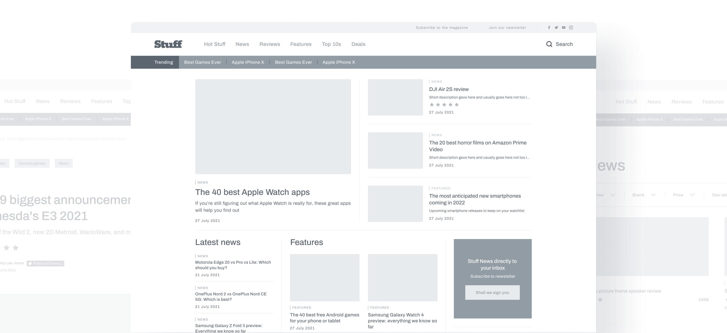
Design System
Typography Foundations

Design System
Colors Foundations

Design System
Components

Visual Design
Here Comes the User Interface
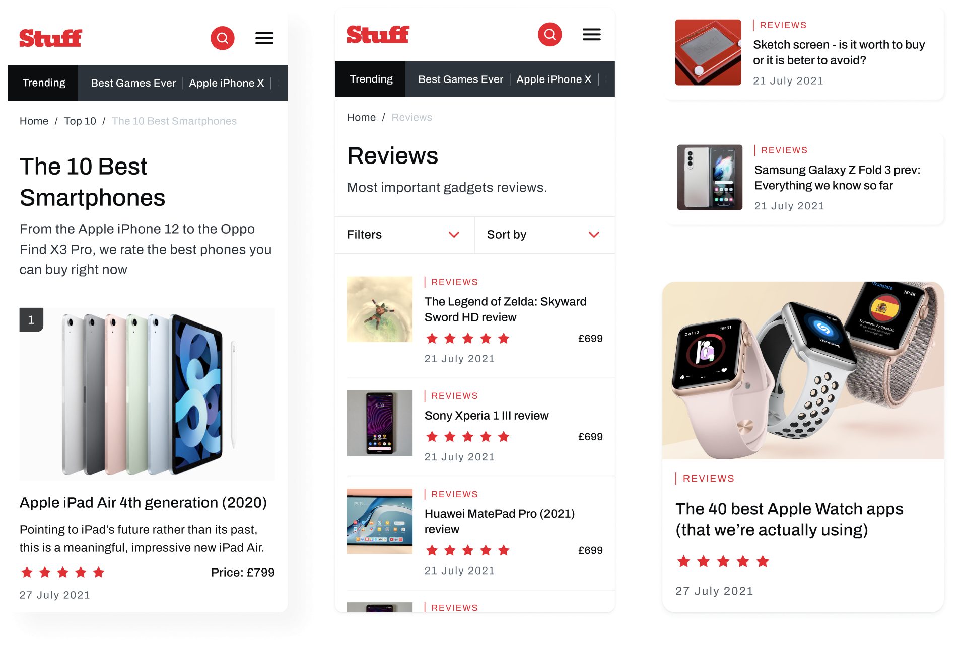
With full confidence that our wireframes meet user goals and needs, our engineering team worked to create a lightning-fast UI, where Stuff readers could browse the latest tech developments with ease.

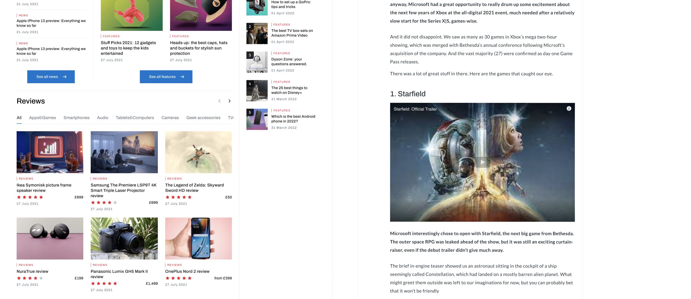

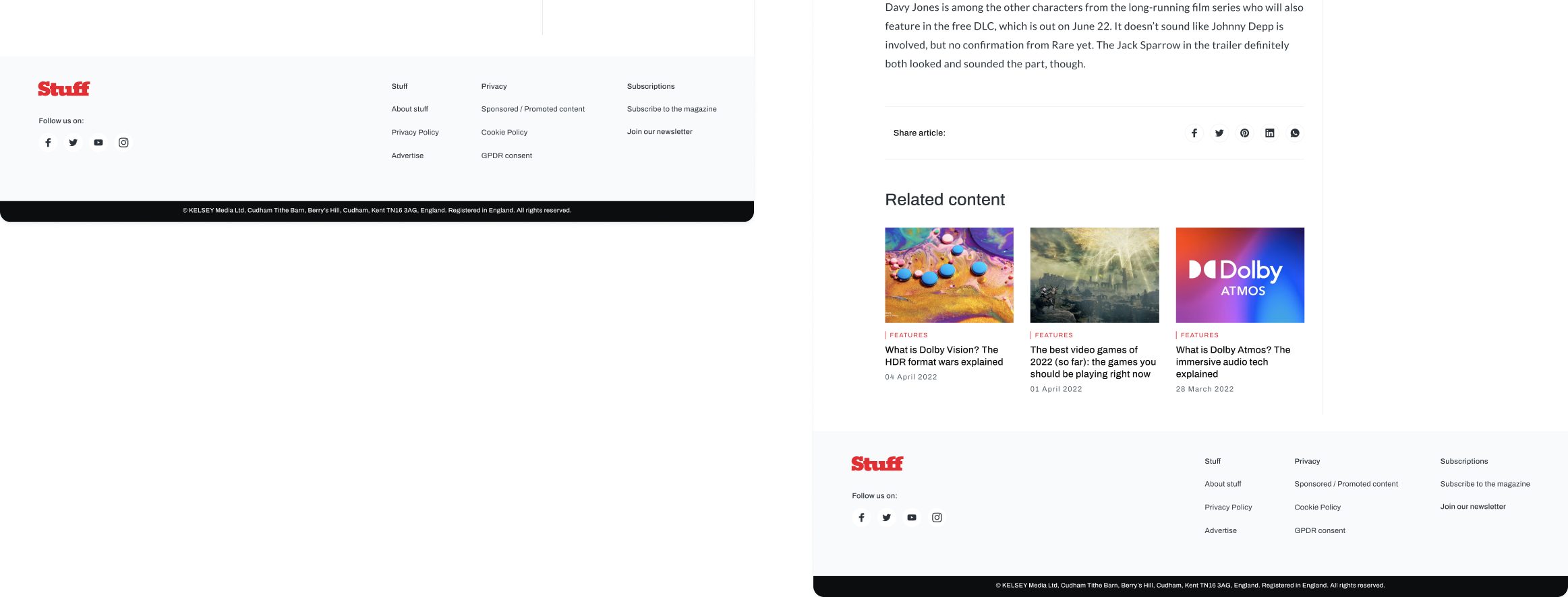
Visual Design
Perfectly Responsive
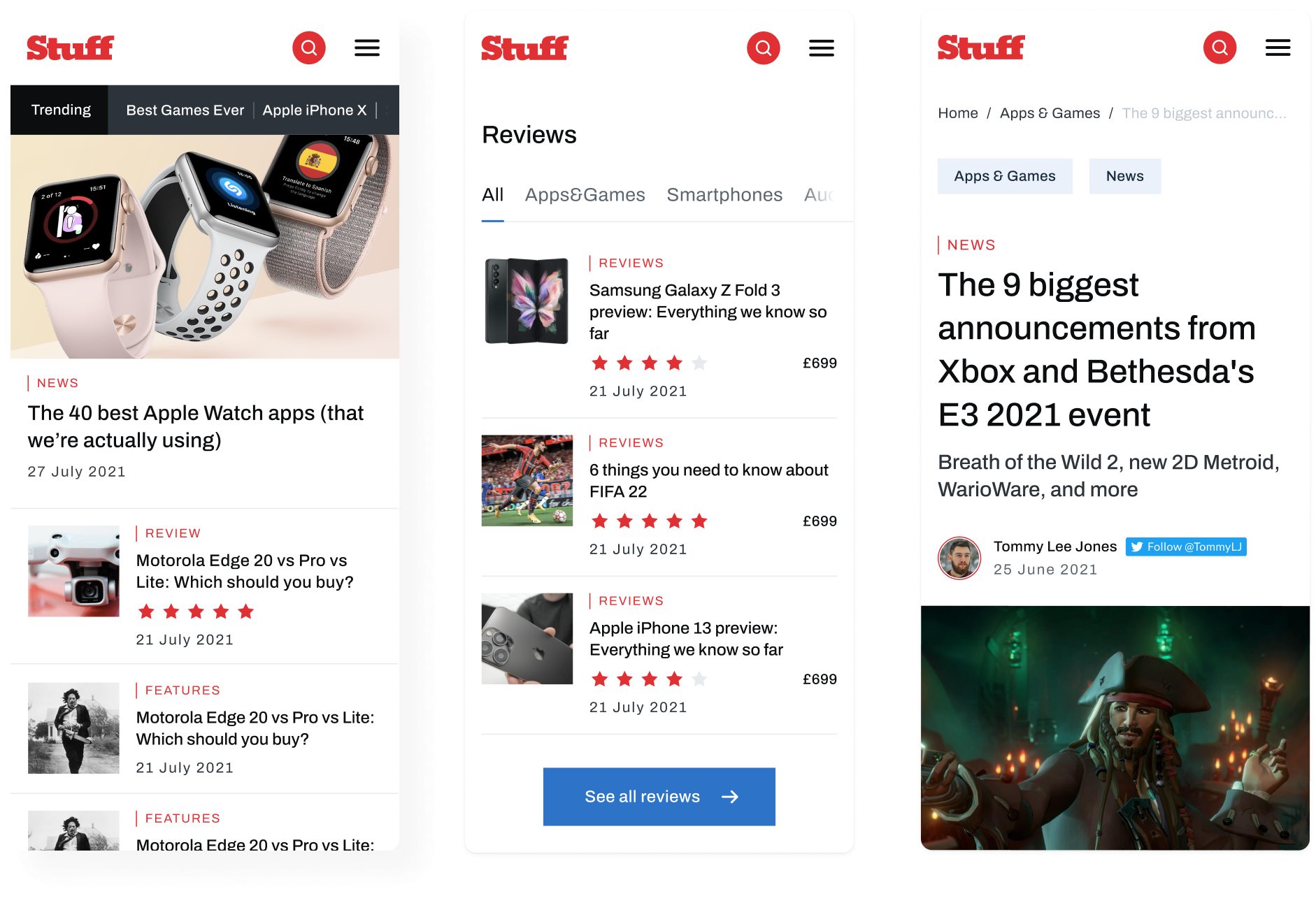
One of the most important aspects of the project was making sure that we created an intuitive mobile experience. Our team worked on a responsive mobile UI that makes browsing Stuff’s extensive catalog of articles easy, with nimble load times and clear routes for exploration.
