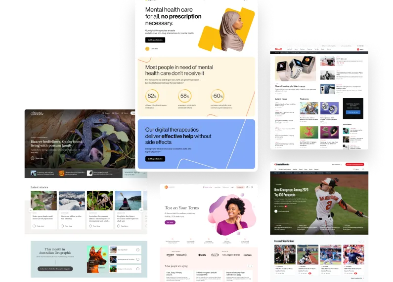
XWP has worked together with Google over the past four years on projects focused on improving the experience for creating content on the open web. Two examples of our collaboration efforts are AMP for WordPress and Google Web Stories.
Recently our team improved the user onboarding for AMP in WordPress. This plugin enables site owners and developers to bring the power of AMP to WordPress and make their sites partially or fully AMP compatible.
My role on the project is a combination of both Product Owner and Product Designer, and I work on understanding how the plugin experience affects many types of users. This means not only focusing on end users, but looking at the workflows of developers, content creators, and site owners. It’s critical to take all these factors into account to ensure that our focus isn’t too narrow and remains inclusive.
User onboarding looks at the first interaction a user has with a plugin or piece of software. Onboarding, or New User Experience (NUX), is a critical part of any software experience.
For this project we wanted to explore how users first encounter the AMP plugin inside of the WordPress interface. This was part of the larger work of improving AMP performance and usability for users on all sides of the WordPress content creation process. So while our progress goes far beyond this onboarding project, it serves as an example of the collaboration efforts between our teams and how we approach problem solving.
In considering the needs of our users, we looked at who would benefit from improvements to onboarding. A typical example of a content creator might be a web publisher looking to improve the performance of their site. They need a turnkey solution to help them focus on delivering great content while knowing their site is accessible to users and will increase engagement. This is a critical step, especially for less technical users.
The Process
As a first step in the design process, we took inspiration from other great plugins and considered the features that users would need to understand AMP and get the most benefit from it.
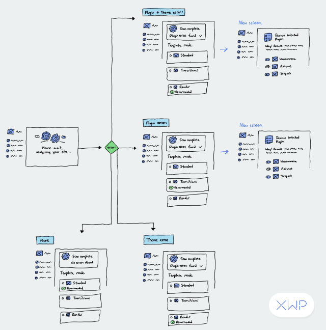
From there we captured the user journey of AMP from activation to set up. We met as a team through online workshops, and used Miro to capture the steps. This allowed us to model out the types of users of the software, and understand as many use cases as possible; not just the happy paths. We wanted to see all the scenarios that users could run into and understand the technical considerations for each.
We captured and discussed multiple flows as we worked through the user journeys. It was important to account for technical users, non-technical users, as well as users focused on the reader mode for their website, the transitional mode, and the standard mode. Each mode, and the technical expertise question, helped to funnel users into specific settings and options.
User Journey Map
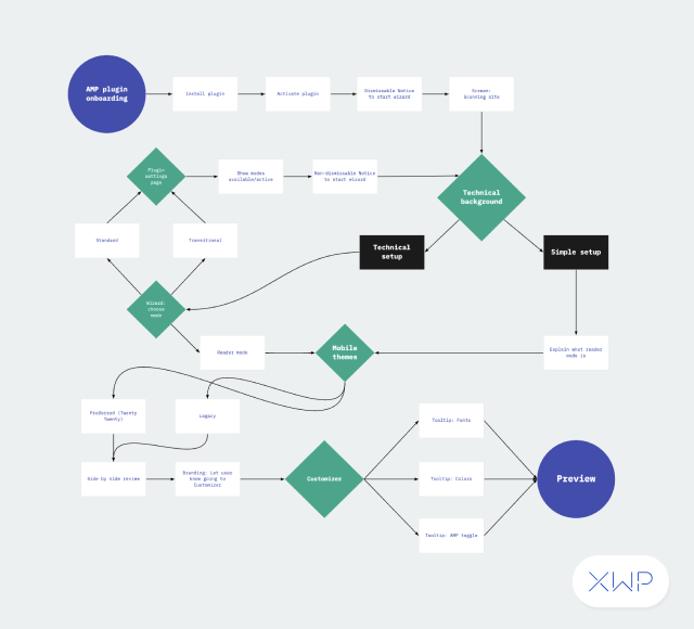
Our flow boards allowed us to review and discuss the connection points of moving through the onboarding process. Getting the steps on paper, so to speak, helped us to understand the technical considerations, and gave me a high-level view to think about the various pages that users would need to work through. After various reviews, and refining the process for an initial release, we shaped up the work into something more visual.
Early Concepts
Using Figma as our prototype software, we created an initial wireframe to get a sense of how the flow would look, and what the various user interface elements would need to do. This gave us the chance to think through the initial visuals and user experience writing.
We added further definition, and found areas where the flow could be improved.
Wireframe
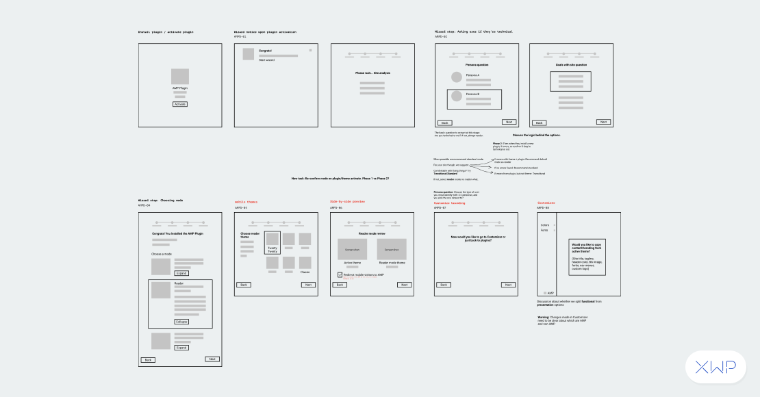
After the initial flows we worked through technical considerations, taking the concepts to higher fidelity.
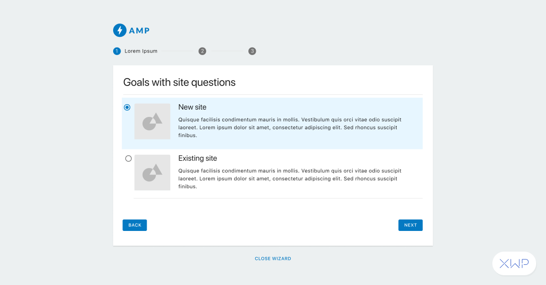
Throughout the process we continued to ensure that we were building a consistent onboarding experience, while balancing a release with future features.
We shipped the onboarding experience in the 2.0 release of the plugin, offering an improved ability for users to understand how the plugin works, and follow a guide for optimal setup.
We also improved the experience of the AMP Settings screen within WordPress. This helps to provide connection between the two interfaces and gives users a place to change the AMP plugin and revisit the onboarding.
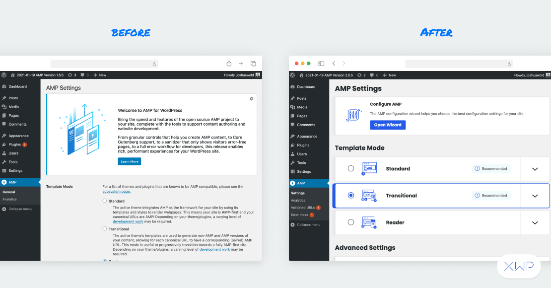
We continue to work on improving the experience of the AMP plugin. The work in onboarding, and the settings screen, helped provide an extra context for users to recall information by choosing a mode and later recognizing it.
We’re applying the same process of discovery as we identify more areas of friction for users and work on improving existing functionality for this product and many others.
Working together on software requires an understanding of your users, a direction for what the software needs, and collaboration between design, development, and the product team. While this is a small piece of the AMP puzzle, it is a first step in improving the connection that users have with AMP for WordPress. We look forward to continuing to improve the experience.

