When it comes to building high-performance websites, small changes to the way your site functions, the content within it, or even the way you work can have a huge effect on user experience.
It’s often thought that performance is all about speed—and that’s definitely a big part of it. But at XWP, we believe that groundbreaking performance is about much more than creating something that’s lightning-fast. It’s a mindset that ultimately guides your entire workflow.
To help make sure you’re getting the best from your work, our performance engineering team put together a list of optimization best practices—with some common pitfalls and simple changes to consider.
Our team of development experts have worked on large-scale optimization projects for the likes of Pantheon, Rolling Stone, and Google. Learn more about how XWP is shaping the web.
Self-Host Your Fonts
Externally hosted font libraries have to establish new SSL connections and add additional DNS lookups before resources can be downloaded. This contributes to slower load times and can have a negative effect on the overall user experience of your site.
That isn’t to say you can’t take advantage of incredible open-source libraries such as Google Fonts, though—their files can often be self-hosted, and in fact, a lot of performance-orientated font delivery methods will require that you self-host.
Self-hosting your web fonts is a fantastic way to boost performance, as it cuts down on the amount of DNS connections usually required by third-party libraries. This alone can have a big impact on site speed, but it can even be improved further when with the clever use of optimized file formats:
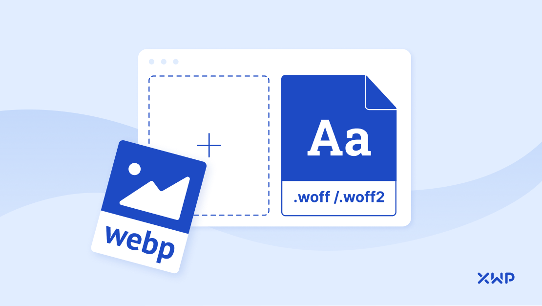
WOFF & WOFF2 for Performance
WOFF and WOFF2 are essentially OTF or TTF files with metadata and compression, and they are supported by all major browsers. They were created to live on the web, and offer some of the best performance available from a font file.
Because WOFF and WOFF2 fonts are already compressed, they load much faster. Using them is a W3C Recommendation and they are widely regarded as the future of font formats.
As the name suggests, WOFF2 is the second generation of the original WOFF file type. WOFF2 offers a 30% average compression gain on top of what is offered by the original, along with the ability to load a single font ‘in parts’.
This means that a font that supports 20 scripts can be stored as ‘chunks’ on disk instead, with browsers automatically able to load the font ‘in parts’ as needed, rather than having to transfer the entire font upfront.
WOFF2 is supported by the vast majority of modern web browsers, with only IE and Opera Mini still lacking native support. In these cases, the Embedded OpenType (EOT) file format can be used as a fallback. That being said, WordPress dropped support for IE after version 5.8, therefore using WOFF as a fallback is mostly sufficient nowadays.
What if You Have to Use External Font Services?
But what do you do when your font licensing doesn’t allow self-hosting?
It’s important that you don’t allow external font services to block rendering. We recommend using Filament Group’s Asynchronous CSS approach for the external font’s primary CSS entry point, and preconnect crossorigin for the domain serving the font assets.
Did you know? Font files are requested using CORS? Font preloads should always use the crossorigin attribute. You can learn more about preloading web fonts on the Google Dev blog.
Always Optimize Your Images
Image files are notoriously heavy. In fact, according to research from the HTTP Archive Web Almanac, they’re the single biggest contributor to page bloat. Making changes to the way you handle image uploads is crucial in keeping those load times low.
At the time of publishing, the median page size on desktop was 2204.8 KB, with images accounting for 979.5 KB (44%) of that total (HTTP Archive’s State of Images Report).
Here are our top tips for making sure beautiful imagery doesn’t slow down your site:
- Format your images to WebP, as the browser support has already exceeded 94%. According to Google, WebP lossless images are 26% smaller than PNGs and 25-34% smaller than JPEG images.
- Don’t introduce CLS with the popular CSS rule: img { display: block; width: 100%; } for images without width & height attributes. Add height: auto to the styles and the width/height attributes matching the aspect ratio. When an image lacks width and height attributes, there would be 0 pre-allocated vertical space for it until the image file is downloaded. This makes elements below shift as the image is loaded in.
- Resize or convert your images to an appropriate size. If you’re using a PNG that doesn’t rely on transparency, convert it to a JPEG—it can slice file size in half!
- Don’t lazy load images above the fold. They are often downloaded too late and can increase perceived page load times. Instead, use lazy loading exclusively for below the fold imagery. Anything above the fold should be considered an important asset, and because of that, should be either preloaded, or allow the default browser’s scheduler to take care of them.
Learn more about how we worked with Jetpack to make lazy loading easier for WordPress users with Jetpack Boost.
Don’t Neglect JS Compression
Across the millions of sites measured by the HTTP Archive, Javascript accounts, on average, for 400KB per page visited on desktop, and around 360KB for mobile users.
Server-side compression of text files such as Javascript can reduce file size substantially. When you consider that GZIP compression can reduce the delivered text file size by 70 to 90%, that original 400KB becomes equivalent to 1.3-4.0 MB.
‘As the major impact of JS is on slow connections and low-end devices, compression is a deal breaker and can make a big difference when it comes to user experience.’
Nicholas C. Zakas, ex-principal Frontend Engineer for Yahoo and Founder of Human Who Codes.
Byte for byte, JavaScript is more expensive than any other file type to process on the page in terms of CPU and time. 400 KB of JavaScript is not equal to 400 KB of, say, image file data, partly because JavaScript processing takes place when the file is uncompressed.
Did You Know? The JS parse time for an ‘average’ device is now close to that seen in flagship phones from 2016, where ~1MB of uncompressed JS is parsed in about a second. In fact, Mid-tier Android devices (~$300) now get the single-core performance of a 2014 iPhone, and the multi-core performance of a 2015 iPhone. Read more about their evolution here.
How to Identify Javascript to Remove
Your first step should be to identify unused Javascript. Anything that doesn’t serve a purpose on the website only increases the number of unnecessary files the user has to download.
Say for example you want to use a library of Javascript plugins (like Bootstrap), you would need to add a link to Bootstrap’s javascript library in your HTML. This doesn’t only include the code for the JS you need, by default It contains the code for all of Bootstrap’s Javascript plugins.
This means that your page is downloading a bunch of JS that it doesn’t need.
The Coverage tab in Chrome DevTools can help you identify unused JavaScript (and CSS), on your website, so that you can remove it and take advantage of an easy performance boost.
Even a small change (~5KB), can make a difference if bundled with other small changes, and on a web where 40% of consumers expect websites to load in two seconds or less, any small change can have a positive impact on user experience.
Learn how to manage Javascript dependencies for WordPress Blocks with XWP
Boost Your Mobile Performance With AMP

AMP-HTML is a subset of HTML with a set of rules applied to streamline mobile performance.
AMP loads quickly because it’s designed for speed. Browsers have an easier (and therefore faster) time interpreting AMP-HTML, because it’s more streamlined, and is specifically designed to help developers avoid the common coding issues that lead to slow page loads. The optimization is powered by JavaScript, and pages are cached with an AMP Cache.
An AMP Cache is a proxy-based CDN for delivering valid AMP documents. AMP caches are designed to safely and efficiently preload AMP pages whilst providing additional user-beneficial optimizations to content.
Having helped create the AMP for WordPress plugin, we’ve been able to see first-hand the performance benefits that running an AMP version of your site can bring, and we often recommend you consider it as an avenue for improving mobile performance.
Read our recent AMP Articles & Guides
Why We Chose Newspack + Native AMP for Cowgirl Magazine
AMP Up Performance with XWP, NOVA, & WP Engine
AMP + Jetpack Made Easy: Adding a Cookies and Privacy Bar
AMP + Jetpack Made Easy – Adding a Carousel Gallery
Don’t Neglect PHP Updates
Keeping the various components of a web server up to date is an important factor in improving security, usability, and performance.
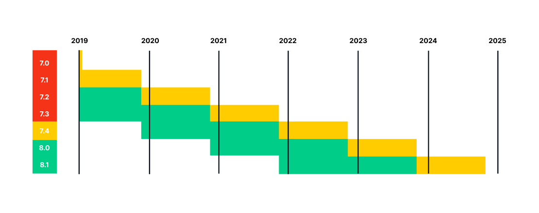
If you are using a PHP version older than 7.4, upgrading to PHP 7.4 can help greatly improve performance. WordPress 5.9 has support for PHP 8.1, while WordPress 5.8 is supported up to PHP 8.0.
Regular updates to PHP should always be included on your product roadmap in line with the compatibility of your CMS, plugins, and theme. As you can see in the table below, one PHP version receives security patches for 3 years, but after that, an update is required.
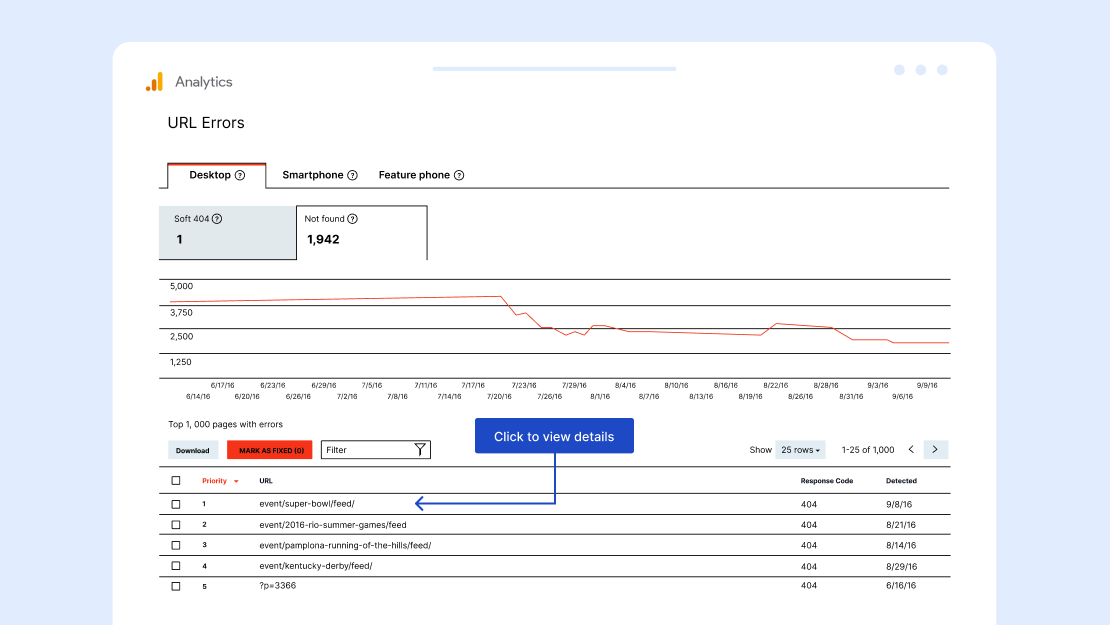
Fix Your 404 Errors
The performance impact of your server sending 404 errors can impact the user experience of your entire website.
404 errors are not only generated when a user attempts to navigate to a deleted or drafted page, but every time a deleted resource is requested. This includes favicons, broken Javascript requests, and any deleted files that are still being referenced.
Identifying and removing references to deleted resources is a great way to boost performance. In fact, in a recent analysis of the effects of 404s on server load, requests were discovered that were as large as 6.7MB.
We don’t recommend installing plugins or modules to check for 404 errors. Instead, we advise you to occasionally run your website through an external service such as the Online Broken Link Checker or a tool like Screaming Frog. This ensures that you aren’t wasting any of your server’s resources on this task. You can also see some of these in the ‘Crawl Errors’ section of Google Search Console.
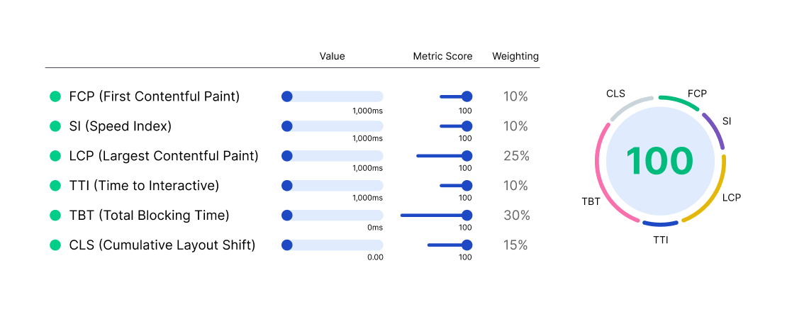
Don’t Overthink a Perfect Lighthouse Score
Google Lighthouse is an amazing tool that can help you understand how your web app is performing. It gives an overall performance score based on industry-standard metrics, weighted according to what studies have highlighted to be important for user experience.
It’s normal to want 100%. After all, we all want the best possible foundations for our website. However, actually achieving it may require other sacrifices to be made that might affect the user experience.
Instead, consider what, if optimized, would have the biggest impact on user activity without sacrificing the business goals of your site. All metrics matter to some extent, but favoring speed metrics such as Largest Contentful Paint (LCP) or prioritizing Cumulative Layout Shift (CLS) Score can have a bigger impact on both KPIs and perceived performance.
Did you know: If you’re using Google Search Console to track Core Web Vitals metrics, you probably already have access to information about your visitor’s experience!
New to Core Web Vitals? Read our guide to CWV and learn more about how they affect your site’s search rankings.
Does Lighthouse Score Affect Users and Sessions?
To an extent, yes. If your lighthouse score is low, it can be indicative of a UX issue that is restricting how many users land and stay on your website.
That being said, the two are not intrinsically tied to one another. Take our work with Cowgirl Magazine for example: By focusing on the performance metrics that matter most, we were able to improve actionable metrics without sacrificing functionality—including an 81.47% increase in new users and a 65.92% increase in sessions.

Join a Performance Community
One of our favorite things about the development space is the community. All around the world thousands of development professionals contribute to each other’s projects, pushing for optimum performance and helping each other achieve their goals.
Being an active member in a development community can be a valuable tool when it comes to ironing out those performance creases. Others may have encountered similar issues themselves and can save you hours of tedious debugging and testing.
The best thing is you don’t need to have an existing performance team to get useful advice from developers! Online communities help people to connect and share globally, with contributions happening over a number of timezones.
The Value of an Open Web
At XWP, contributing to an open web is core to our culture. We believe that progress happens through collaboration and that supporting developers both internally and externally provides growth and opportunity.
If we all contribute what we can, where we can, sharing our ideas, resources, and expertise, we have the power to collectively change what the internet can do for us. Performance optimization is an integral part of this, and providing a faster, more accessible web is something we care deeply about.
To hear some of our team talk about what an open and community-driven web means to them, and why it’s so integral to our mission at XWP, check out the Season 2 finale of the XWP Tonight Show, celebrating 100 XWPeople.
Performance is Our Culture
We’re proud to support the web development community with the help and advice they need to make performance part of their strategy.
Want to learn more about performance beyond speed? Read our article The Four Pillars of Website Performance.
Our fully-remote team of more than 100 experts now spans more than 36 countries and 17 timezones. From Canada to Australia, South Africa to Ukraine, you’ll find exceptional XWPeople all over the world, serving our clients and building a better web together.
Want to learn more about what makes us tick? Find out How Remote Works at XWP or search our vacancies.